Brand guidelines
How to show
AI Search Leaders.
For partners, vendors, event organisers and press: our logo files, colours, type and voice, and how to use them when you make something with us or about us.
In a hurry? Download the logo, keep the neon green as a fill with dark text on it, and send us a look before it goes out.
Downloads
Logo files.
SVG for anything that scales, PNG (1600px wide, transparent) for everything else. The name is outlined, so you don't need our fonts to place it.






Older files with the name in capitals and underscores (AI_SEARCH_LEADERS) or a glow around the mark are retired. Please replace them with these.
The name
AI Search Leaders.
Three words, each capitalised, every time.
- Do: Write AI Search Leaders. In running text, “the community” is fine after the first mention.
- Do: Our product is Terrain: an AI search diagnostic for brands and agencies. On first mention, “Terrain, from AI Search Leaders”. It uses the AI Search Leaders logo; it has no logo of its own.
- Do: Our address is searchleaders.ai.
- Don't: Not AISL, AI-Search Leaders, AI Search leaders, AI SEARCH LEADERS or AI_Search_Leaders.
- Don't: Don't translate the name, shorten it, or use it as a verb or a hashtag of your own.
- Don't: Don't imply we endorse a product or vendor unless we've agreed it in writing. We're vendor-free, and that's the point.
The logo
The mark and the name.
Three bars, the middle one in neon and shifted right: search moving forward. Use the full logo wherever there's room; the mark alone where the name is already said.
Clear space
Keep at least half the mark's height clear on every side. Nothing else goes in it: no text, edges or other logos.
Clear space = ½ × mark height
Smallest sizes
Below these the bars start to blur together. Smaller than that, use the app icon.
- Full logo
- 120 px wide on screen · 30 mm in print
- Mark
- 20 px wide on screen · 6 mm in print
- App icon
- 16 px and up
The app icon
For small, square places (social avatars, favicons, app tiles): the mark in paper and neon on an ink square. It holds down to 16 pixels.
Please don't
Colour
Ink, neon and paper.
Mostly paper and ink, with one bright thing. The neon is a signal: the main button, a highlight, the middle bar.
Ink
The frame: text, dark bands, the logo
- HEX
- #08162A
- RGB
- 8 22 42
- OKLCH
- 0.2 0.045 258
Neon
The signal: one action or highlight per view, always with ink on it
- HEX
- #72E882
- RGB
- 114 232 130
- OKLCH
- 0.85 0.17 148
Paper
The page: backgrounds
- HEX
- #FAFAF6
- RGB
- 250 250 246
- OKLCH
- 0.985 0.005 105
Using the neon
As a fill, with ink text on it. Once per page, slide or screen.
Never as text on a light background: it can't be read. On ink, a word or two in neon is fine; never glowing.
Supporting colours
Emerald
Text links on light backgrounds
- HEX
- #00673D
- RGB
- 0 103 61
- OKLCH
- 0.45 0.11 158
Forest
The map's index lines and marks
- HEX
- #245337
- RGB
- 36 83 55
- OKLCH
- 0.4 0.07 155
Contour
The map's lines
- HEX
- #7B9C81
- RGB
- 123 156 129
- OKLCH
- 0.66 0.055 150
Slate
Secondary text
- HEX
- #4E5969
- RGB
- 78 89 105
- OKLCH
- 0.46 0.03 258
Rule
Hairlines and borders
- HEX
- #CED3C9
- RGB
- 206 211 201
- OKLCH
- 0.86 0.015 130
Mist
Secondary text on ink
- HEX
- #AEB9C4
- RGB
- 174 185 196
- OKLCH
- 0.78 0.02 250
For charts, lead with neon for the series that matters and use ink, slate and the map's greens for the rest. Don't add a second bright colour.
Type
Three typefaces, all free.
A grotesk with a point of view for headlines, a clear sans for reading, and a mono for labels and numbers.
Clash Grotesk
Headlines and the wordmark. Semibold (600), set tight.
Fontshare, free (ITF Free Font License)Find your bearings.
Switzer
Everything people read: body copy, captions, slides' running text. Regular (400) and Semibold (600).
Fontshare, free (ITF Free Font License)A paid, private peer network for senior search people, with honest signal you can trust.
JetBrains Mono
Small uppercase labels, coordinates and numbers that line up. Medium (500).
Google Fonts, free (SIL Open Font License)Expert session · Wed, Nov 4 · 5:00 PM ET
- Do: Headlines in Clash Grotesk Semibold, sentence case, tight: tracking about −3%, line height 0.95–1.05.
- Do: Body in Switzer at a comfortable size, lines no longer than about 70 characters.
- Do: Labels in JetBrains Mono, uppercase, small, spaced out (+14%). Use them sparingly, for metadata.
- Don't: Don't set body copy in Clash Grotesk, or headlines in the mono.
- Don't: Don't use all caps for headlines, or terminal-style labels like ///SYSTEM_STATUS.
- Do: If you can't install the fonts (say, in a slide tool), use Inter or Arial for both headlines and body.
The map
Contours and survey marks.
AI search is new territory, and our members are the people mapping it. Our imagery is a survey map: contour lines, a route, and square marks.
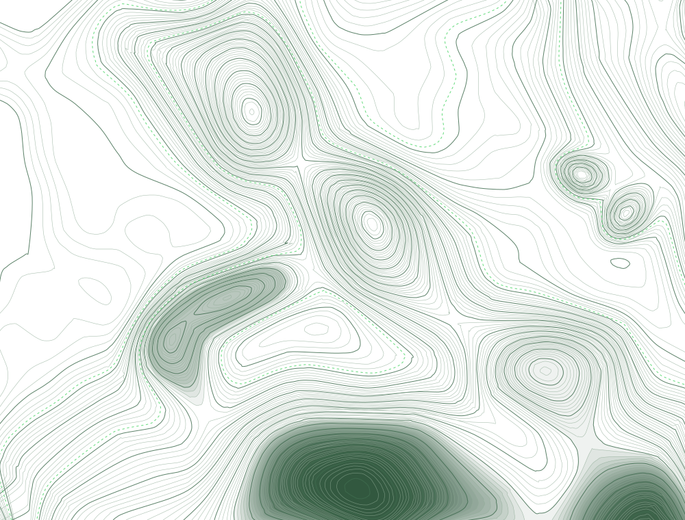
- Do: Keep the map quiet: thin green lines on paper, or paper-toned lines on ink.
- Do: Use map words in headlines (bearings, territory, you are here), not in labels or instructions.
- Don't: Don't put contours behind body text, tables or charts, or animate them on a loop.
- Don't: Don't use circuit boards, glowing grids, robots or brains for “AI”.
Voice
A senior peer, not a pitch.
Precise, assured and forward. We sound like an experienced practitioner talking to another one: plain words, real evidence, no hype.
Evidence over opinion
Say what we saw and where it came from. Numbers with their source; claims we can back.
Peers, not vendors
We sell clarity and capability, not software tricks. No hard sell, no fear of missing out.
Respect attention
Short sentences, the point first. Senior people are busy.
Sounds like us
- “What AI answers read about your brand, and what to do about it.”
- “This week's session: what changed in the pages AI Overviews cite, and what we're testing next.”
- “Senior search people working out AI search together.”
Doesn't
- “The ultimate GEO playbook to dominate ChatGPT!”
- “SEO is dead. Here's what's next.”
- “Revolutionary AI-powered visibility, 10x your traffic.”
- Do: Sentence case for headlines and buttons. Dates like “Wed, Nov 4”, with times in Eastern Time (ET).
- Don't: No em-dashes, exclamation marks or emoji in headlines.
Working with us
Co-branding and events.
Sponsors, speakers, partners and event organisers: what we ask when our name appears next to yours.
- Do: Side by side with another logo, match the two by height, separate them with a thin rule or a full clear space, and give neither more weight.
- Do: On slides and event screens, the reversed logo on ink works best. Keep our neon off your own buttons and charts.
- Do: Describe us as “the community for senior search people working out AI search”, or quote our site.
- Don't: Don't lock our logo up with yours into a new combined logo.
- Don't: Don't use member names, photos or quotes without their permission and ours.
- Do: Send anything public with our name on it to tom@searchleaders.ai before it goes out.
Something not covered here?
Ask, and we'll help or send the file you need.
Back to searchleaders.ai.