Brand guidelines / Podcast
The AI Search Leaders
Podcast.
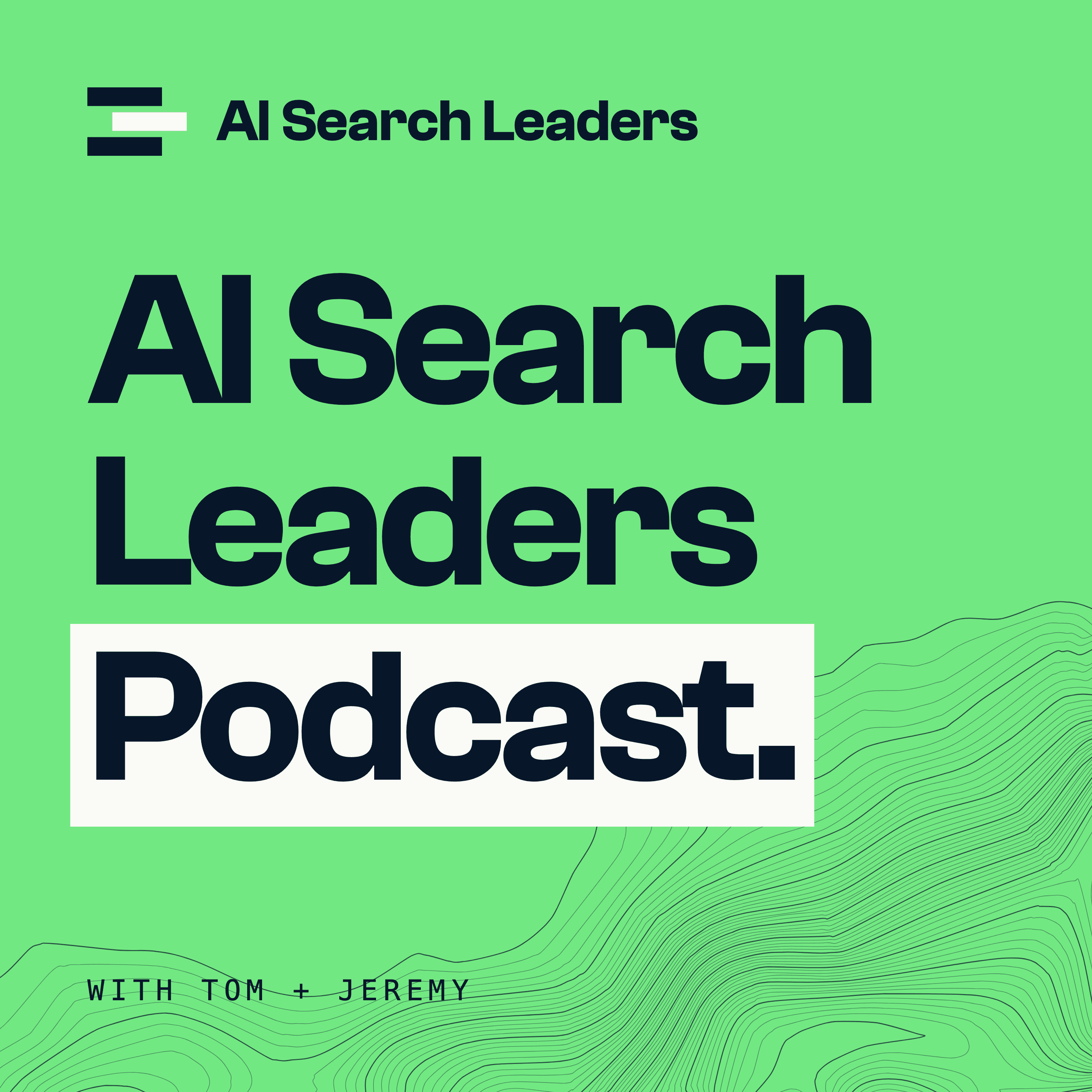
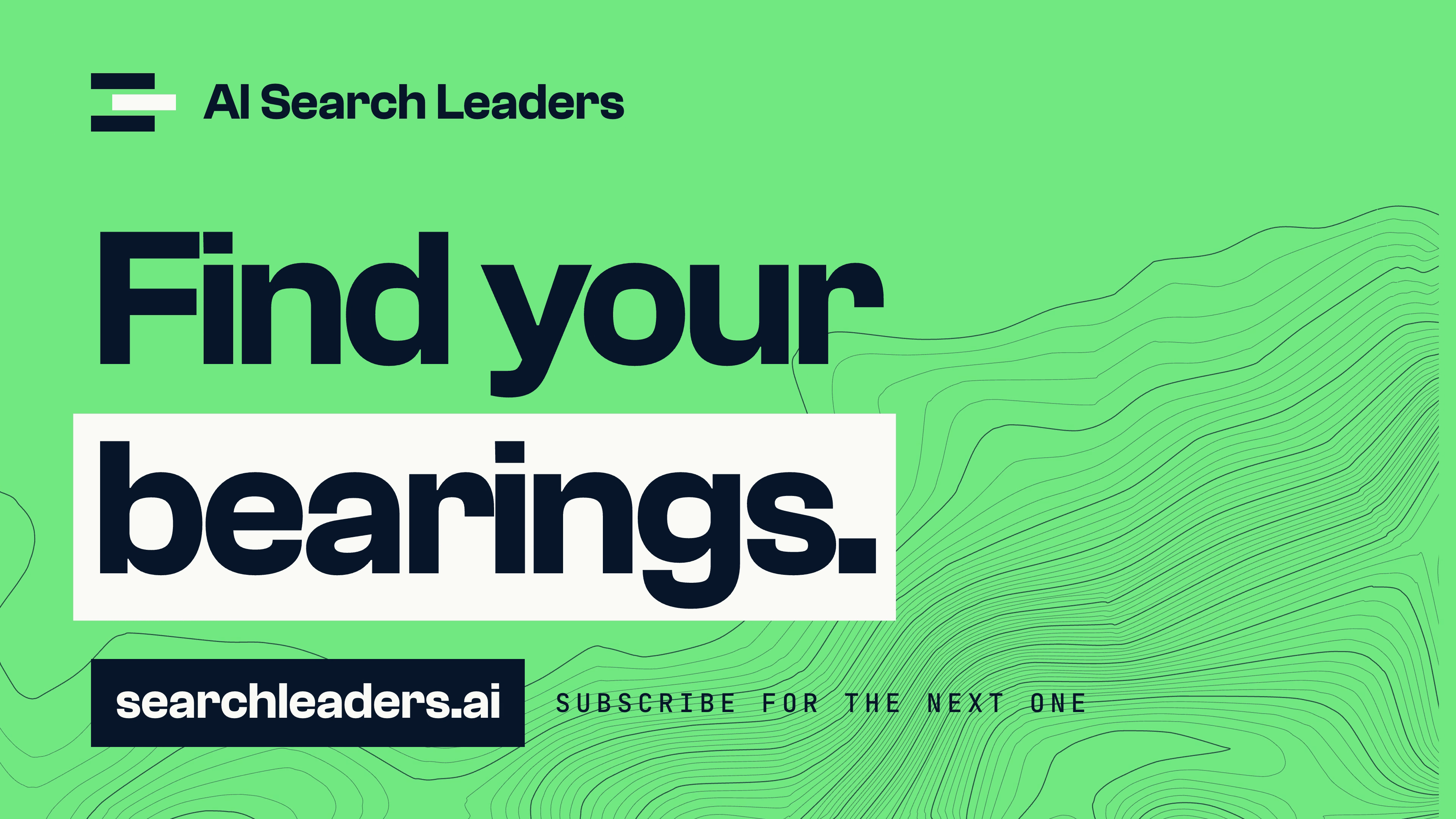
How the show looks, for whoever edits an episode, cuts its Shorts or makes its thumbnail. It is the same brand with the ratio turned over: neon is the ground.
In a hurry? Take the editor's kit, set the title in ink on neon, and put one paper block behind the words that matter.
The system
The same brand, turned up.
A podcast competes in a feed, so it gets the loud end of the palette. Nothing new is added: the mark, the three colours, the three typefaces and the map.
- 01
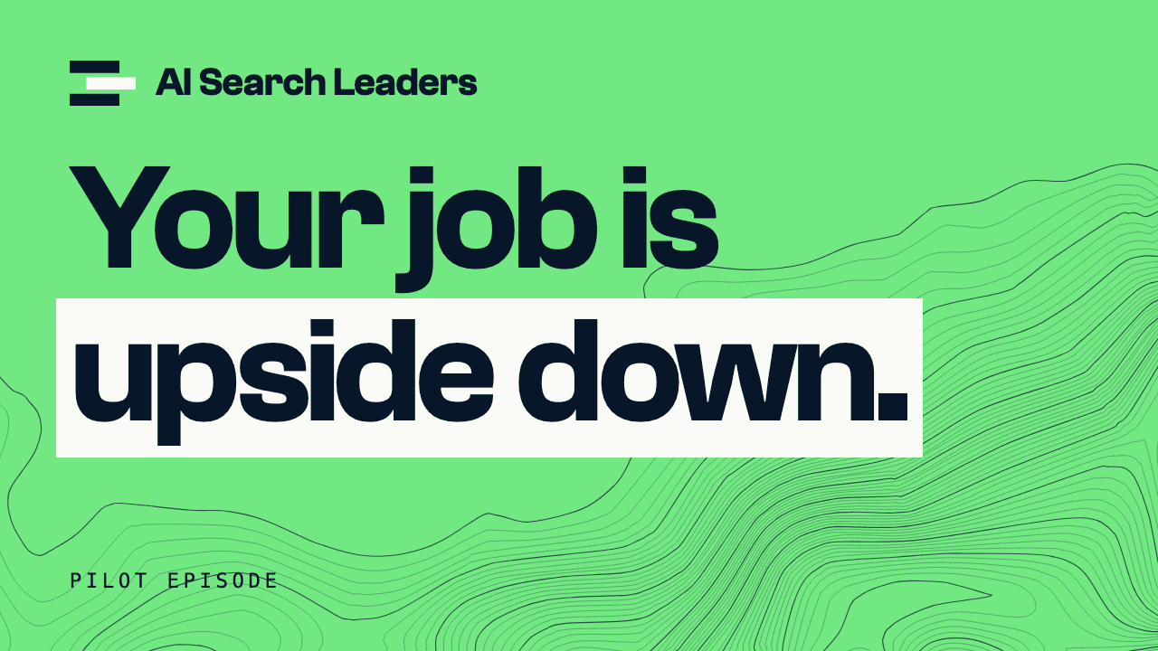
Neon ground
The whole frame is neon. On the site neon is one button; here it is the room.
- 02
Ink type
Clash Grotesk Semibold in ink, as large as the frame allows. Tracking −4%, line height 0.95.
- 03
One paper block
A paper block sits behind the words that carry the line. One per frame.
- 04
Contours from the corner
The map rises from the bottom right, in thin ink lines. The title's ground stays clear.
- 05
A mono label
One small line in JetBrains Mono capitals: the episode, the speaker, the hosts.
The site
The podcast
- Do: On neon, the mark's middle bar is paper, and the two outer bars and the name are ink. On ink and on photos it is the usual reversed mark, in an ink tile.
- Do: Titles are sentence case and end with their punctuation: a full stop or a question mark.
- Do: Paper is for the block and nothing else. Photos are real stills from the episode, uncut and ungraded beyond the episode's own grade.
- Don't: No second bright colour, gradients, glows, drop shadows or outlined type.
- Don't: No cut-out heads, arrows, emoji or shocked faces. We are a senior peer in the feed, too.
- Don't: Don't run contours behind the title, or put a title on a photo without a block under it.
Thumbnails
One line, five words.
The thumbnail is a line someone said in the episode, not a description of it. Three layouts, picked by what the episode gives you.
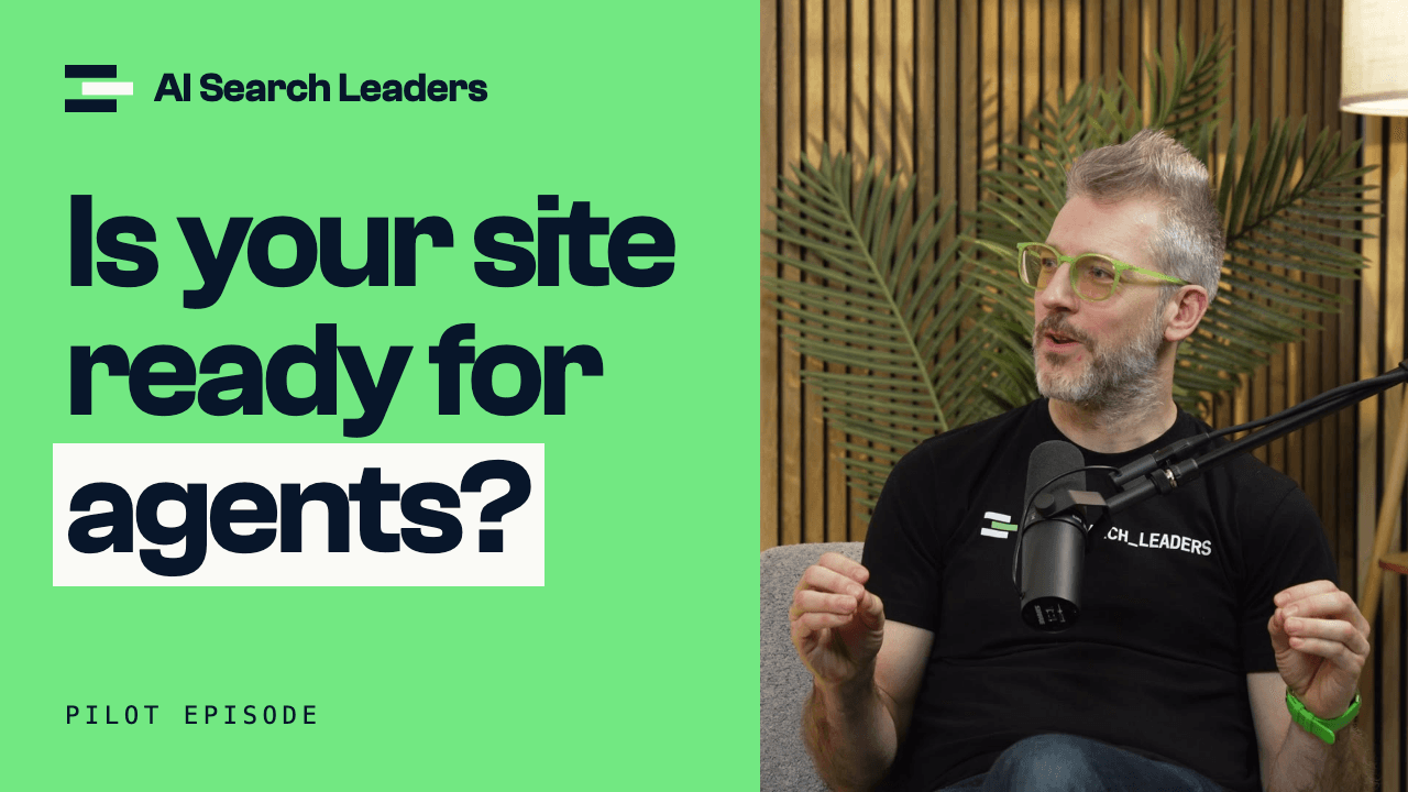
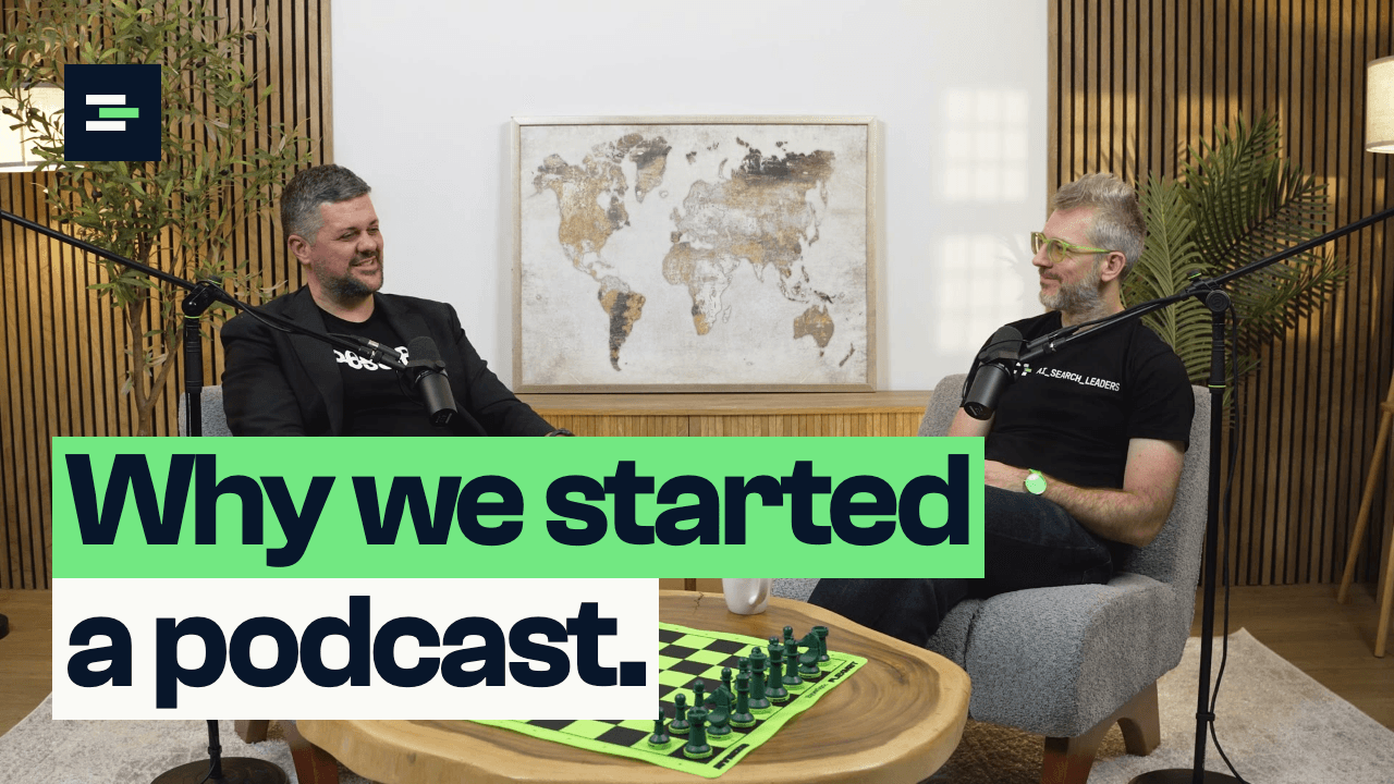
- Do: Five words or fewer, in two or three lines. The paper block goes on the last line.
- Do: Check it at 160 pixels wide, the size it has in a phone's feed. If the line can't be read there, cut a word.
- Do: The mono label says which episode it is: “Episode 004”, or a guest's name.
- Don't: Don't repeat the thumbnail's line as the video's title. The title says what the episode covers; the thumbnail says why to care.
- Don't: No “SEO is dead”, no capitals for emphasis, no exclamation marks.
In the episode
Stings, names, chapters, quotes.
Graphics sit on the footage as flat blocks and cut in and out. Nothing dissolves, glows or bounces.
How it moves
One order, every time, and it all lands inside a second and a half. Then it holds.
- The mark
- The two ink bars land from the left; the middle bar moves forward into place.
- The title
- Rises line by line from behind a mask, 0.13 seconds apart.
- The block
- Wipes in from the left just before its words arrive.
- The map
- Draws once, from the summit outwards, and never loops.
- In and out
- Hard cuts. Ease out on everything that enters; nothing eases in.
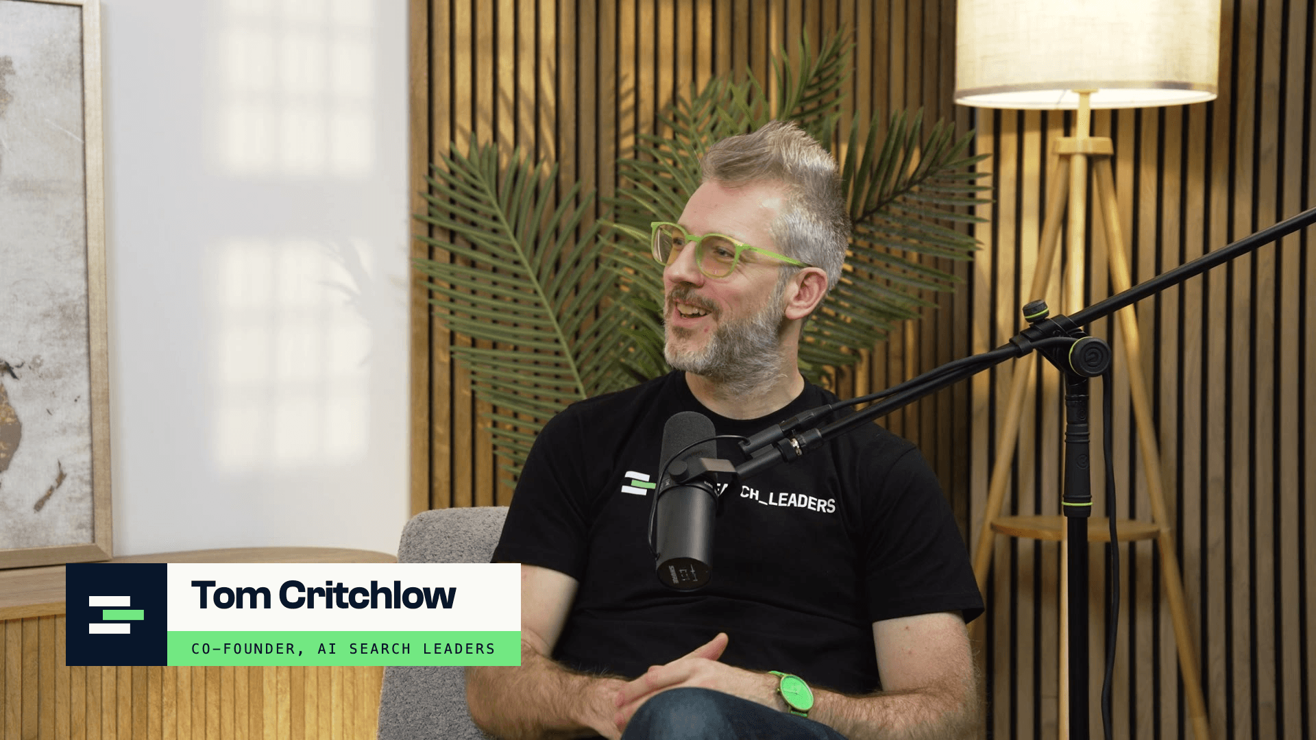
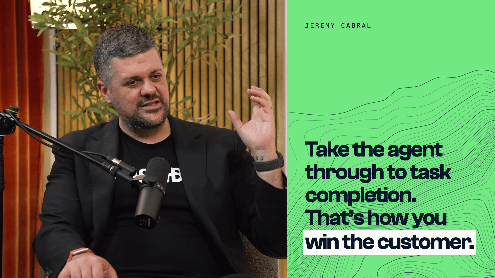
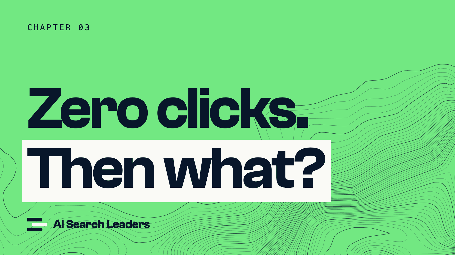
- Do: One graphic on screen at a time, and at most one every half minute.
- Do: Graphics come in on a cut or a breath, never over the start of a sentence.
- Don't: Don't caption the whole episode in this style. Full captions are YouTube's own; the blocks are for Shorts.
Shorts
The line on top, the words in blocks.
A Short is one thought, under a minute, cut from an episode. The neon band says what it is about before anyone speaks.
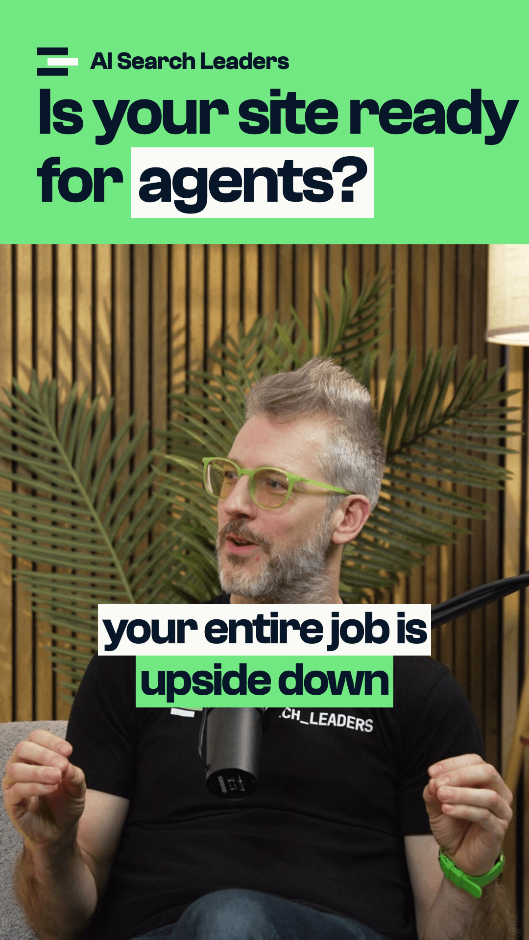
- The band
- The top quarter, neon, with the logo and a line of six words or fewer. It stays for the whole Short.
- The footage
- The speaker's close-up, cropped to fill the rest. Cut to whoever is talking.
- Captions
- Two lines at most, three to four words each, in paper blocks. The phrase being stressed gets a neon block.
- Clear space
- Nothing in the bottom fifth or the right-hand eighth: the apps put their buttons there.
- The end
- The vertical closing sting, two and a half seconds: the address and “Watch the full episode”.
- Do: Start on the first word of the thought. No sting, no “welcome back”.
- Don't: No word-by-word bouncing captions, no progress bars, no emoji.
Sound and picture
How an episode is finished.
The numbers an episode is delivered at, so each one sounds and looks like the last.
- Loudness
- −14 LUFS integrated, true peak no higher than −1 dBTP.
- Voices
- Both hosts within 1 LU of each other; the room's hum and rumble below 80 Hz filtered out.
- Music
- Under the stings and the cold open only, at least 12 dB under speech.
- Picture
- 3840 × 2160 at 23.976 frames a second, Rec. 709.
- Colour
- Warm and natural. Match every camera to the close-ups' white walls and skin before any look goes on.
- Cuts
- Hard cuts between cameras and into graphics. No dissolves to white.
Editor's kit
Files for the edit.
Everything an editor needs to cut an episode and its Shorts in this style. Each file downloads at full size.
Stings
Drop in as they are. No sound: lay your own sting or music under them.
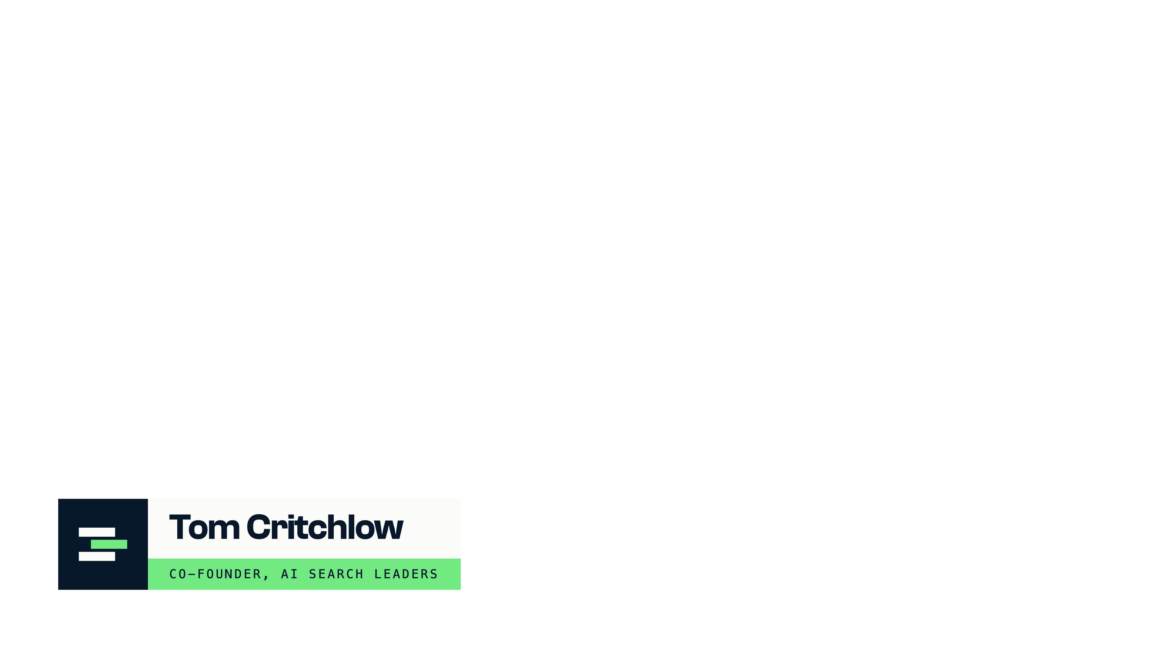
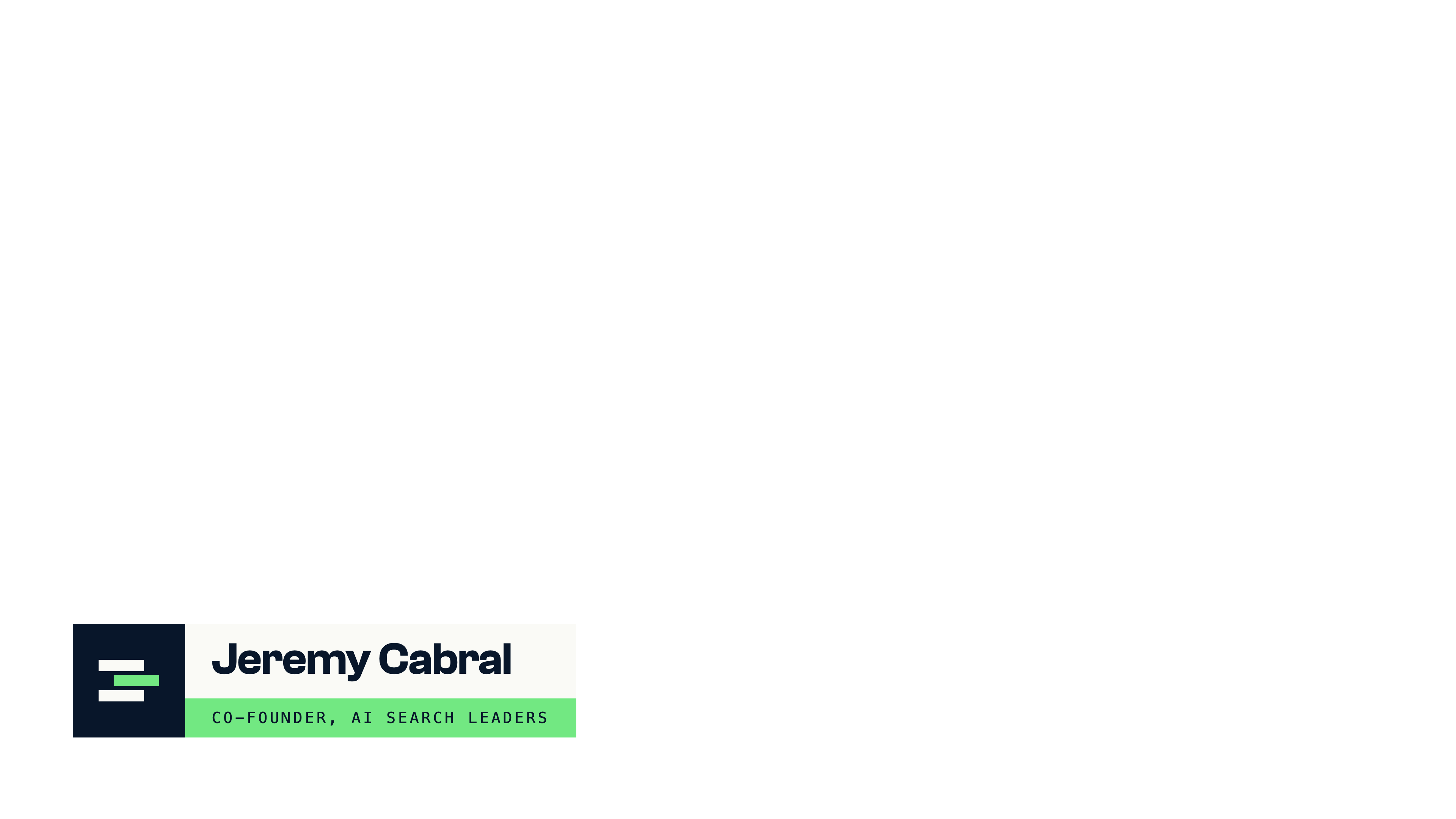
Lower thirds
The animated files have a transparent background and build in and out by themselves, five seconds in all. Lay one over the footage at 100%, top-left to top-left.
Tom Critchlow, animated
3840 × 2160 · 23.976 fps · 5 s · ProRes 4444 with alpha
20.5 MBDownload
Jeremy Cabral, animated
3840 × 2160 · 23.976 fps · 5 s · ProRes 4444 with alpha
20.6 MBDownload
Tom Critchlow, still
3840 × 2160 · transparent PNG
62 KBDownload
Jeremy Cabral, still
3840 × 2160 · transparent PNG
65 KBDownload
Blank templates
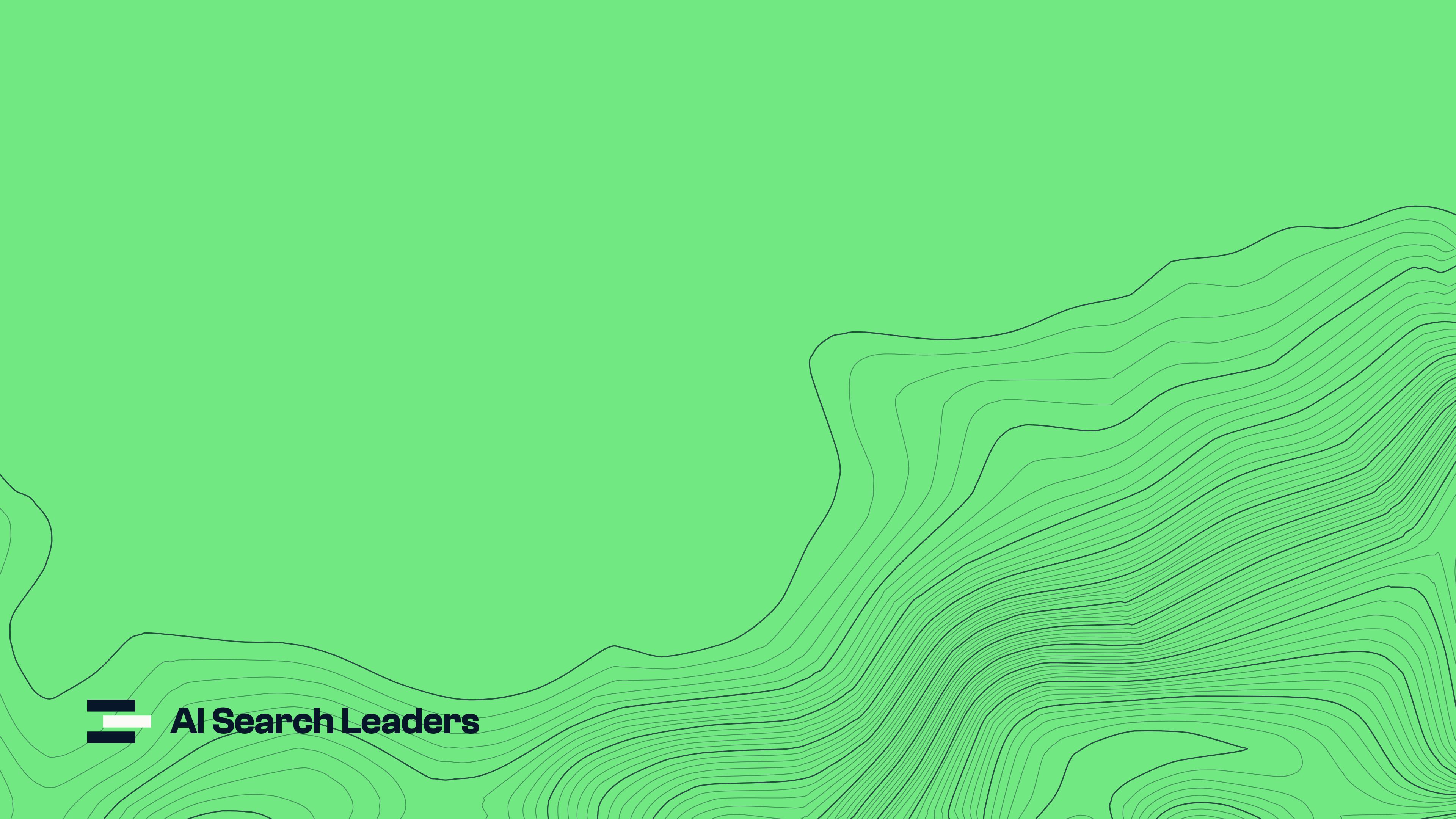
Backgrounds with no words on them. Set the words yourself in Clash Grotesk Semibold, ink, with a paper box behind the last line.
Chapter card, with the logo
3840 × 2160 · PNG
1.2 MBDownload
Neon ground with contours
3840 × 2160 · PNG
1.0 MBDownload
Quote panel, right-hand side (flip it for the left)
3840 × 2160 · transparent PNG
980 KBDownload
The band for a Short, with the logo
1080 × 1920 · transparent PNG
21 KBDownload
Contours, ink lines for neon
SVG
52 KBDownload
Contours, paper lines for ink
SVG
52 KBDownload

Cover and thumbnails
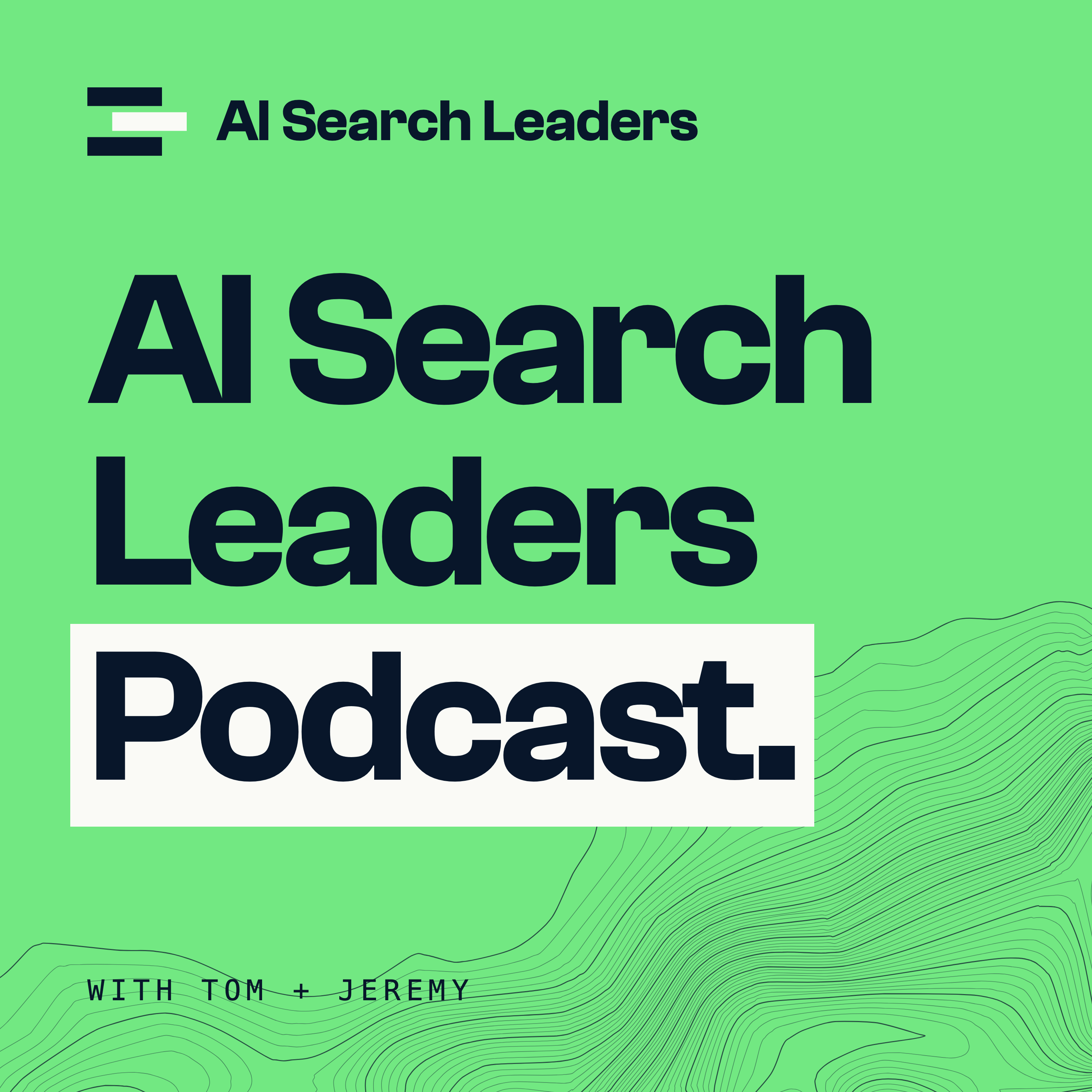
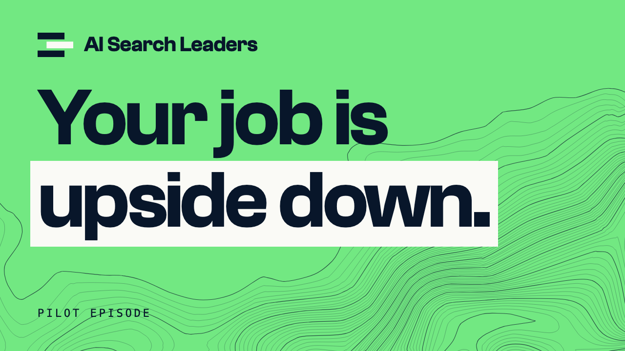
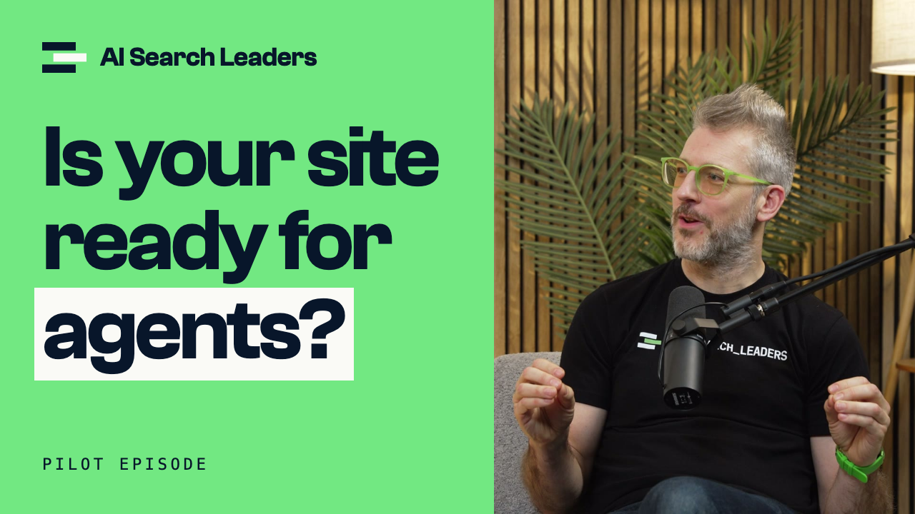
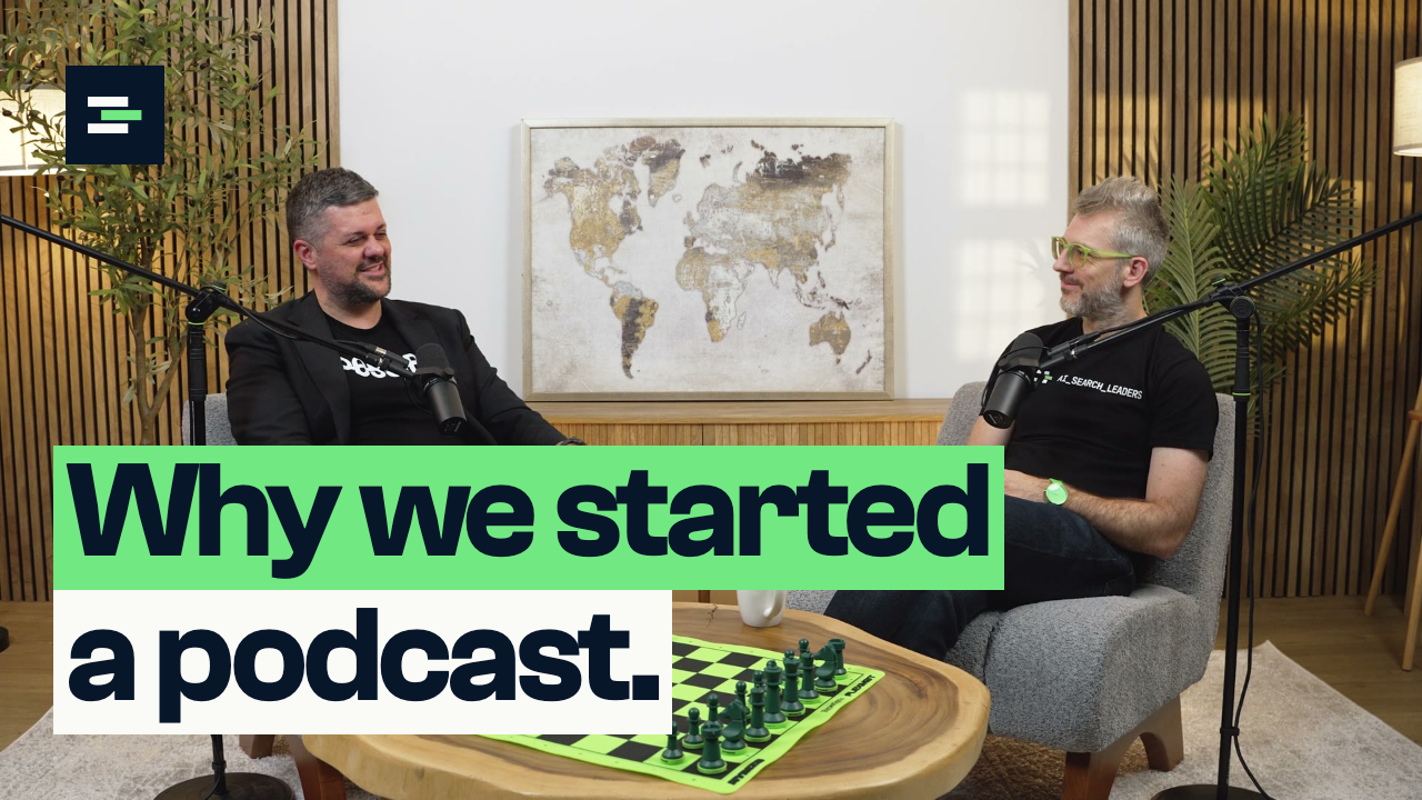
Finished pieces with the pilot episode's words. For a new line, ask us: they are drawn in code.
Project setup
Both typefaces are free. Install Clash Grotesk and JetBrains Mono before opening the project.
- Timeline
- 3840 × 2160, 23.976 frames a second, Rec. 709. Shorts: 1080 × 1920.
- Neon
- #72E882 · RGB 114 232 130
- Ink
- #08162A · RGB 8 22 42
- Paper
- #FAFAF6 · RGB 250 250 246
- Titles
- Clash Grotesk Semibold, tracking −4%, line height 0.95, sentence case.
- Labels
- JetBrains Mono Medium, capitals, tracking +20%.
Need another name on a lower third, a new thumbnail line or a file in another format? Email tom@searchleaders.ai. Logo files are on the brand guidelines.